Want to share the story behind your custom cap or label? Email me.

11.16.2012

The Bottle Cap Bar of Dodge Brewery

After four and a half years of brewing, Eric Dodge finally has all the badging of the pros. He's put his family crest logo on t-shirts and labels before, but nothing says "official" quite like a bottle cap.
Classy? Quite. 
But wait...it gets even classier. Saddled with an outdated bar in his basement, Eric Dodge decided to jazz it up with bottle caps. He edged it in wine corks, laid out a substantial collection of bottle caps, and covered the top with half-an-inch of clear resin for a solid top surface.
The ultimate basement accessory.
Check out the cork siding.
A custom cap in action!
Dodge's only regret? Not using more custom caps. My only regret? Not having a basement where I can have my own bottle cap bar.

If you collect or otherwise craft with custom caps, check out our quarter technique tutorial—by far the best way to remove a bottle cap without damaging it.

11.06.2012

Design Resources

Check out our new and improved Design Resources page. We revamped all the material and put everything on one single page. From templates to screencasts, we've got all the information you need to create a fantastic bottle cap, all in one place!
Design like this!
Not like this.


10.23.2012

Design Lesson #5: Clip Art and Finishing Touches

At long last, the quest for a perfect bottle cap design is over! Check out the final steps of the Tully design in this fifth Inkscape screencast. You'll learn how to use the Open Clip Art Library, how to draw stars, and how to use the dropper tool. Remember to double-check your design at 1" to make sure no element is too small! Seriously!!!


And here's the cap in real life:
Rock it, kitteh.
Now if only I could brew and bottle such a beer...

10.19.2012

Bierkast and LA Ale Works

Some folks love beer so much, they can't have just one cool beer project—they need two. Such is the story of Kip Barnes, a founding member of both Bierkast and L.A. Aleworks.

Bierkast began as a group of beer lovers and exploded into a blog of tremendous energy. It's the kind of site that puts 99.9% of bloggers to shame—yours truly not withstanding. While it chiefly spotlights personalities and events in the Los Angeles beer world, Bierkast offers its readers much more than that. It's slick, it's entertaining, it's wide-ranging, it's personal. It's passion on a webpage.
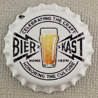
And here's passion on a cap.
Now I know you're not doing anything productive on this lovely Friday, so go check out Bierkast. But beware the green-eyed monster jealousy: some of the writers went to Oktoberfest.

Because a kick-ass blog is not enough, Kip needed a kickstart project, too. L.A. Aleworks is a handcrafted work-in-progress. Tired of the less-than-thrilling brewing scene in LA, John Rockwell and Kip Barnes decided to take matters into their own hands and start their own brewery. LAAW promises to be a boutique community brewery. They're starting with their award-winning homebrew recipes...

Gams-Bart Roggenbier (a Bavarian hefeweizen brewed with rye malt instead of wheat malt)

Dampfmaschine (a California Common, aka Steam beer)

Lievre Saison

With a few custom caps, their sample bottles now have both the look and the taste of the pros.
Expect a Kickstarter campaign soon to support the launch of LA Aleworks. Keep up with LAAW news on Bierkast here.

Major props to graphic designer Ken Barnes (father of Kip). You can tell he has mad branding skills. Both the Bierkast and LAAW logos translate phenomenally on bottle caps. Nothing's too small, nothing's too complex, and the strong color contrast makes every element pop. These are the kinds of logos you remember.

Here's to more ale in the city of angels!

9.28.2012

Design Lesson #4: Curved Text

Everyone loves curved text on bottle cap designs, and it's one of my favorite tricks for getting both important content and a fun design into a small space. Curving your text gives a label to your beer without overlapping or upstaging a large center graphic. Here's how to do curved text in Inkscape. This is the most complex step yet, but once you've watched the video, you'll be able to do it right every time! Warning: contains a couple of cat puns.


9.27.2012

Review from Bull City Homebrew Shop

Over the last year, BottleMark has been causing a bit of an online stir among homebrewers. I've seen a lot of reviews on blogs and forums--and then there are those 438 five stars of feedback from our customers (enough to make even George S. Patton blush)--but I can't help but shout out a special thanks for the recent BottleMark review on the Bull City Homebrew Blog.

Located in Durham, North Carolina, this homebrew store ordered some logo caps to sell as promotional magnets. And I think they liked them!

Magnety goodness.
We've also got an in-store coupon available for patrons of Bull City Homebrew, so if you're near Durham, go get thee some yeast, hops, barley, and a special custom cap offer.

What with passionate homebrew shops and custom caps for homebrewers, revolution is indeed brewing.

9.20.2012

The Brons Standard

With his first foray into craft beer, Justin Brons felt the divine touch of Saint Gambrinus. He started keeping a notebook, a written record of playful flavor combinations he'd want to try in a beer. Inspiration soon led to perspiration. Craft breweries are certainly pushing the envelope, but they have yet to brew a Boysenberry Pale Ale. Well, Justin Brons has.

The Brons Standard certainly sets a high standard for flavor fusions. Justin and his fiance started with an Espresso Oatmeal Stout, and soon followed up with such unique beers as Blood Orange-Honey Maibock, Bourbon-Vanilla Porter, Toasted Pecan Oktoberfest, Honey-Lemon Hefeweisen, and a Pumpkin-Pumpkin Pie Porter. Yes.

Such innovation deserves branding. Branding like this:
I love the color scheme, the contrast, the two possible tops to the design. It's rich without being busy. So what's the Brons Standard for bottle cap design? Keep it simple. "If you look at professional craft brew caps, the caps are very simple.  You need to get across the attitude and image of your brewery, and you don't need a whole lot on there to do that.  For mine, I was just trying to keep it fun and organic." Amen, brother. You can really tell that your cap is successful when it looks good from far away.
A pro-class line-up.
Labels present a different design playground. The labels Justin likes to design have more color and detail than the caps, but the aesthetic principle remains the same: simplicity can speak volumes.

Let's admit it. A beer called Godzilla Dopplebock really does deserve the full cap-n-label treatment.
Ready to stomp Tokyo in style
Thanks for sharing your inspiration, Justin! We look forward with great anticipation to a Bacon and Fruity Pebbles Pale Ale. No, wait, nevermind. That sounds terrible.