Want to share the story behind your custom cap or label? Email me.
Showing posts with label labels. Show all posts

5.04.2015

Super-powered Labels

Custom bottle caps are great for keeping your beers straight, but you can only fit so much on a 1-inch circle. A true brewer needs a larger canvas, and so we are proud to bring you...


LABELS!

But these aren't just any labels. They're super-powered HOMEBREWER labels! 

Super powers include...
  • Easy on and easy off—guaranteed! A crooked application is easy to correct, and when it's time to reuse your bottles, there's no tearing or sticky adhesive left behind.
  • Waterproof! Go ahead. Put them in your cooler. 
  • Sized at 4-inch x 3.25-inch, our labels work in landscape or portrait orientation.
  • Rich, full-color graphics for the true professional look.
And perhaps the greatest super-power of all...
  • A minimum order starts at just 6 labels--perfect for a 6-pack! Order just what you need, and don't waste your money on what you don't.
We've got our easy-upload tool working for labels and caps. And just like our caps, BottleMark is selling labels at a low, low price: $0.60 per label for edge-to-edge full-color graphics. With our many cap colors to choose from, you can now enjoy a fully customized bottle from BottleMark.

You don't go out to play naked. Why should your beers? Give your brew the respect it deserves with BottleMark Labels.

6.23.2014

Three-Year Deal

While our blog may be a little stagnant, BottleMark is far from it! We've been hard at work, wearing ALL THE HATS, bringing you the very best custom bottle caps technology can offer.
Okay, it's possible this hat wasn't for work.
And BottleMark just turned 3!
We're wishing for more brewers like you!
To celebrate, we're offering you a sneak peak into our near future: something very special, very sexy, and done the BottleMark way.
Motley Brüe is ready to rock!

Like us on Facebook for an exclusive "beta label deal" available only to our Facebook fans.

10.19.2012

Bierkast and LA Ale Works

Some folks love beer so much, they can't have just one cool beer project—they need two. Such is the story of Kip Barnes, a founding member of both Bierkast and L.A. Aleworks.

Bierkast began as a group of beer lovers and exploded into a blog of tremendous energy. It's the kind of site that puts 99.9% of bloggers to shame—yours truly not withstanding. While it chiefly spotlights personalities and events in the Los Angeles beer world, Bierkast offers its readers much more than that. It's slick, it's entertaining, it's wide-ranging, it's personal. It's passion on a webpage.
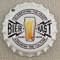
And here's passion on a cap.
Now I know you're not doing anything productive on this lovely Friday, so go check out Bierkast. But beware the green-eyed monster jealousy: some of the writers went to Oktoberfest.

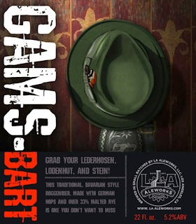
Because a kick-ass blog is not enough, Kip needed a kickstart project, too. L.A. Aleworks is a handcrafted work-in-progress. Tired of the less-than-thrilling brewing scene in LA, John Rockwell and Kip Barnes decided to take matters into their own hands and start their own brewery. LAAW promises to be a boutique community brewery. They're starting with their award-winning homebrew recipes...

Gams-Bart Roggenbier (a Bavarian hefeweizen brewed with rye malt instead of wheat malt)

Dampfmaschine (a California Common, aka Steam beer)

Lievre Saison

With a few custom caps, their sample bottles now have both the look and the taste of the pros.
Expect a Kickstarter campaign soon to support the launch of LA Aleworks. Keep up with LAAW news on Bierkast here.

Major props to graphic designer Ken Barnes (father of Kip). You can tell he has mad branding skills. Both the Bierkast and LAAW logos translate phenomenally on bottle caps. Nothing's too small, nothing's too complex, and the strong color contrast makes every element pop. These are the kinds of logos you remember.

Here's to more ale in the city of angels!

9.20.2012

The Brons Standard

With his first foray into craft beer, Justin Brons felt the divine touch of Saint Gambrinus. He started keeping a notebook, a written record of playful flavor combinations he'd want to try in a beer. Inspiration soon led to perspiration. Craft breweries are certainly pushing the envelope, but they have yet to brew a Boysenberry Pale Ale. Well, Justin Brons has.

The Brons Standard certainly sets a high standard for flavor fusions. Justin and his fiance started with an Espresso Oatmeal Stout, and soon followed up with such unique beers as Blood Orange-Honey Maibock, Bourbon-Vanilla Porter, Toasted Pecan Oktoberfest, Honey-Lemon Hefeweisen, and a Pumpkin-Pumpkin Pie Porter. Yes.

Such innovation deserves branding. Branding like this:
I love the color scheme, the contrast, the two possible tops to the design. It's rich without being busy. So what's the Brons Standard for bottle cap design? Keep it simple. "If you look at professional craft brew caps, the caps are very simple.  You need to get across the attitude and image of your brewery, and you don't need a whole lot on there to do that.  For mine, I was just trying to keep it fun and organic." Amen, brother. You can really tell that your cap is successful when it looks good from far away.
A pro-class line-up.
Labels present a different design playground. The labels Justin likes to design have more color and detail than the caps, but the aesthetic principle remains the same: simplicity can speak volumes.

Let's admit it. A beer called Godzilla Dopplebock really does deserve the full cap-n-label treatment.
Ready to stomp Tokyo in style
Thanks for sharing your inspiration, Justin! We look forward with great anticipation to a Bacon and Fruity Pebbles Pale Ale. No, wait, nevermind. That sounds terrible.

8.30.2012

Duck Street Brewing Co.

When it comes to design, homebrewer Brian Parker isn't just winging it.
Duck, Duck, Beer!
This cap truly fits the bill. The black-on-white contrast makes for a bold statement, and I'm really down with the design's simplicity, allowing the unique font and the detailed graphic to take flight.

Duck Street Brewing Company also features far from fowl labels for each of the brews.


Brian enjoyed working on the labels so much that he got interested in bottle cap design and found BottleMark. He's got all the right instincts: go to town on the labels, keep the cap super-clean, fly south for winter.

And name your brewery after something that facilitates puns. Because serious blog posts aren't all they're quacked up to be.

4.19.2012

Relic Brewing

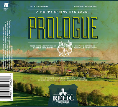
We all believe in brewing a bit differently, but Relic Brewing has turned it into a business. This Connecticut nanobrewery specializes in small batch craft beer, like a hoppy spring rye lager or an American IPA with flavors of lemon, grapefruit, and late-added brown sugar. To prove that their beer is art, they put as much care into their design work, too.


Designer Kieran McCabe explained his scheme: "The logo is meant to be an illustration of both the artistic and creative nature of craft brewing as well as a nod to traditional beer iconography. Relic's vision for all of it's artwork is to let the beer be the inspiration and it all has to be as unique and interesting as the beer." The logo has great old-school flair, and the labels are wonderfully complex. If the package looks this good, the beer must be fantastic!

If you live near Plainville, Connecticut, go seek out 95B Whiting Street on a Friday, and you'll discover a place that's anything but plain. You'll be pleasantly greeted by 22 oz. bottles, some great taps, and people passionate about their beer.


4.16.2012

Jack's Studio Brews

While he may be a trained graphic designer and photographer, Jack Daniel loves even more working with chemistry and contraptions in the lab and in the kitchen. With Jack's Studio Brews, he's found a way to unite these divergent interests.
They're...beautiful...

Jack's cap hits the design sweet spot: the perfect balance between detail and simplicity. The text is bold and easy to read (even when it gets small), there's a fantastic play of colors that makes for great contrast, the borders add energy...I just love it. The image pops at the size of an inch, but it's definitely not simple. Designers take note.

To prove that Jack knows what he's up to, here's what he can do with a larger canvas:

Roaring good.
Looks like Jack's got some mad Illustrator skills and probably the beer to go with it, too. Since settling in San Diego to pursue his passions professionally, Jack's been busy making small batch beers, wine, even a fine Ceylon tea brewed with leaves imported from Sri Lanka.
Tea and tea contraptions, showing here.
Jack contemplates the meaning of life. It probably has something to do with good brews.
 Next up? A ginger ale. And hopefully more glorious graphics, too.

3.28.2012

Karll's Crest Cap

Back in 1968, Tim Karll of Denmark handcrafted his first beer. 44 years and over 6,000 liters later, he's finally capping his work his way.
Sealed with a seal
Tim took inspiration for his caps from his family crest of arms, which traces all the way back to 1700.

Since we can't have the pleasure of sampling it ourselves, here's some eye candy of the custom capped #148, a Brown Ale. I must say we're totally honored by this international shout-out.
 
Keep on brewing, Tim, and we'll keep pushing your caps through customs!

3.02.2012

Moondance Magic Brews

Phil Moore's brew story begins with a Welsh Corgi he and his wife adopted as a pet. But a dog who answers to "Barley" quickly became a top dog, officially known as "Champion Dalarno Moondance Magic Brew." Barley has won three 5-point majors and earned his championship at Pembroke Nationals in Portland, Oregon in 2002. And he's one well-traveled pooch. As his proud owner reports, "Barley swam in the Atlantic and Pacific Oceans in the same month, walked Pickett's Charge at Gettysburg, hiked part of the Appalachian Trail, and peed on the Gateway Arch in St. Louis." A chance few of us get in a lifetime!

With such a legend in the house, no wonder Phil named his brewery after Barley. When it came time to create a logo, Phil contacted his friend and famed Corgi Artist Art Smith (corgiart.com). Inspired by Barley's enjoyment of frogging by the pond, Art created this enchanting logo...

 ...now on a bottle cap!

Keeping with the theme, Phil pairs some other great Corgi labels with his logo.
Black Magic
German Alt
Palmetto Peach (a peach wheat beer)
While not quite as famous as Barley, Phil Moore is also a champion, having won several best in shows for his brews, and he was even one of four finalists in Sam Adams's Longshot Homebrew Competition in 2011. Apparently, a corgi and a brewer is a winning combination.

2.27.2012

B&C Brewery

B&C Brewery recently showed me some outstanding and totally original graphic talent.
 
Unlike many of us who went straight for the barley, Russ and wife Renie Gallant started their homebrewing careers with wine. They named their winery R&R Red Grin (after the effect great red wine has on your teeth). Russ decided to put his fine arts degree to work and design labels to crown their achievements. After some hard work painting, photographing, and Adobe illustrating, voilà!
That's one classy label.
When they turned to beer making, Russ and Renie wanted something more casual, more in the spirit of brewing and consuming beer, but still with a splash of personal flair. They found inspiration for their brand in their two playful, Jamaican-name-inspired cats: Bammy and Callaloo.
Bammy (a Jamaican bread made from cassava but also a gray tabby who really wants to catch his tail)
Callaloo can has beer? (Named after a Jamaican leafy green)
Russ set to work on a cartoonish design with retro graphics and strong colors that would really pop against the amber glass of a bottle. The labels include a generous banner space for notating their most recent concoction.
Totally a-mew-sing

Knowing as every good graphic designer does that a 1-inch bottle cap needs a more simplified look, Russ scaled this graphic back to feature just the cats and the name with a checkered background.
Compare the two and note the changes. B&C has provided a great example of how you can take a complex logo and make it into a successful bottle cap.
The complete package
While Russ and Renie may keg most of their brews, whenever one of these bottles shows up to a party, Banny and Callaloo are sure to make a splash! Brew on, B&C Brewery.

10.31.2011

Backyard Bounty

Robby from Alexandria, VA created this beauty.
I can almost smell them!
In his second year of growing his own hops, Robby had a big enough yield to hop a recent batch. He brewed a wet hopped harvest ale, and while the wort was boiling, he literally dashed to his backyard and returned with the bounty you see here—with just enough time to snap the picture he used for the cap, of course. Don't believe me? Check out the photos on his awesomely-named blog Profiles in Pourage.

Robby completed the look with some rockin' custom labels.
All dressed up and heading for the fridge. (Nice book, too.)
About his backyard bounty Robby jokes, "Soooo holistic, right? From bine to beer to bottle cap." Bravo!

10.03.2011

Shizmo Brewing Co.

With a little bit of luck, you should be seeing this cap yourself in the future:
Lucas E. Szymanowski is living the American (homebrew) Dream. Inspired by Alton Brown's Good Eats (and who isn't?), Szymanowski started with a simple extract Belgian homebrew. Soon after, the wife joined the fun, and brewing equipment took up permanent residence in the house. Three years and many Belgian beer awards later, the Szymanowskis are now in hard-core planning mode to launch their very own commercial craft brewery. Their graphic is even professionally designed. A hobby no longer!
Totally legit.
Why call it Shizmo? Well, sometimes those nicknames from old school days just stick.
Shizmo Brewing Co's Hibiscus Saison
What's brewing now: Shizmo's Oktoberfest label
So if you're living West Coast style, keep an eye out in 2012 for these beauties. Best of luck with the launch, Shizmo! May we savor one of your Cinderella-story saison's soon!
Website: http://www.shizmobrewery.com/